Statement Furniture, Luxe Finishes, And Objets d’art – A Chennai Home That Has It All
Sleek, sophisticated, and smart; this contemporary home emulates tight angles, mixed surfaces, floor to ceiling sideboards and a concealed-door foyer. It was a cakewalk for the designer and founder of Chestnut Storeys, Farah Agarwal, when a first-time client approached her to design his 3,800 sqft apartment. With a clear requirement of a simple, contemporary home, Agarwal infused the modern abode for a family of three with her distinctive aesthetic and style. “The client’s brief was straightforward. He wanted a modern, contemporary space with a bit of plush, while making sure it was not too cluttered. He had seen our previous work and liked our aesthetic,” adds Agarwal, who was quite understanding of the deliverables for Project Crest.
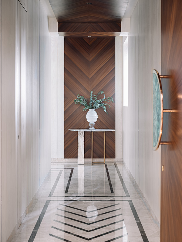
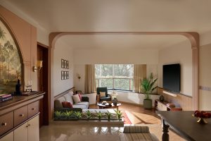
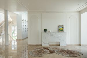
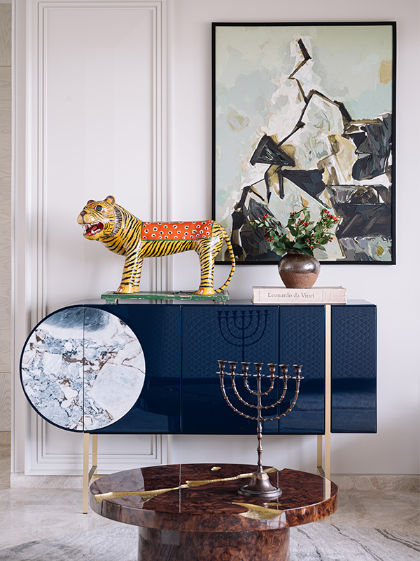
A narrowly designed foyer musters a chic welcoming entrance to the 4-BHK apartment with a black marble inlay flooring. The foyer further directs to the guest room and the puja room before leading into the living area. Transcending the living area with the client’s requirement of a modern house, Agarwal decided to incorporate lush European furniture with some fragments of Indian artwork and artifacts. “We matched the client’s brief of a smart, contemporary home with wood-paneled walls that camouflaged the doors from the foyer to the living room. We didn’t want exposed doors, where they would materialize as a frame. The lighter coloured wood finishes come off as a natural wall paint colour, which doesn’t make it look heavy,” adds Agarwal, who balanced the finishes of the structure with the design style.
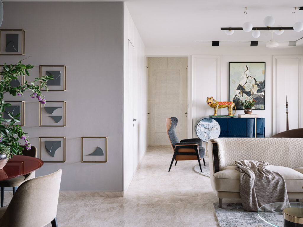
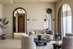
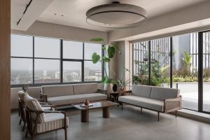
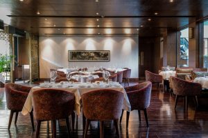
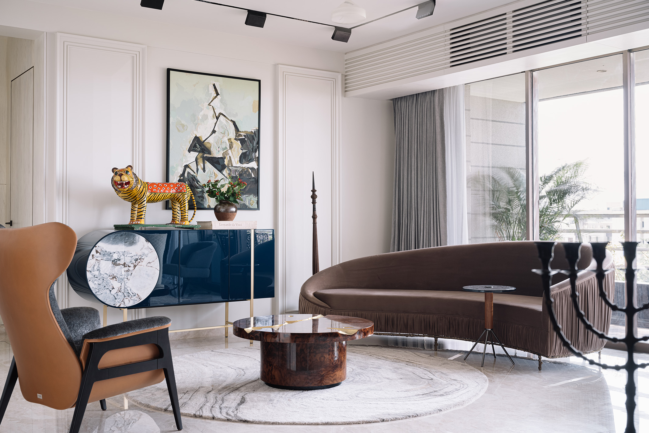
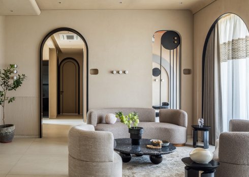
Agarwal bifurcated the living room into two seating corners as it had to be used to entertain guests as well as for the family to spend time together. The one end of the living area, a free and luxurious vibe with picturesque soft curves, circular shapes and neutral colours takes over, as opposed to standard liner design, while the other end divisionally summarises the dining section with a beautifully round Porada red top dining table amid wooden panelled and grey-toned walls.
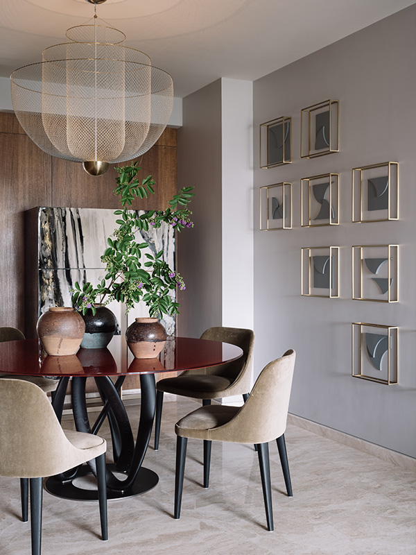
Reminiscing her stance on subtly breaking the neutral palette, she says, “We matched the requirement of a neutral, contemporary home throughout, except the living room. I sat with the client and explained to him that though the house will follow a neutral palette throughout, it would just end up looking like many other neutral, contemporary homes. How about we make it look different without taking away the essence of what he (client) wants. Eliminating too much fuss, we introduced a simple, dim red coloured dining table sitting in the company of a Baxter blue side table and grey and wood-paneled walls.”
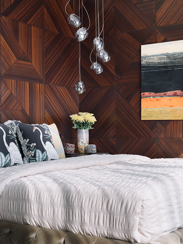
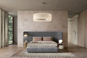
The wooden finish in the master bedroom adds warmth and coziness to the space. The full-length window floods the room with natural light, while the sliding shutters in the walk-in zone that is paneled with a mirror illustrate the illusion of space. A bespoke blue custom-made bed adjacent to the ivory paneled wall highlights the solid colour scheme of the second bedroom.
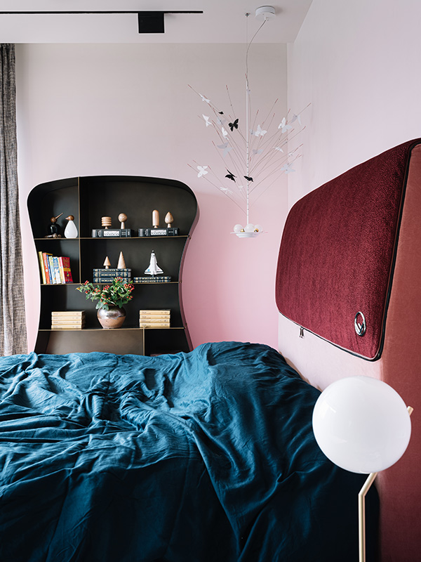
Adding a whimsical charm to the daughter’s bedroom, Agarwal incorporated a tailored ombre finish wallpaper, thereby breaking the monotony of a typical pink palette. “I didn’t want to give the usual solid pink. We eliminated the idea of painting the room because we weren’t getting the right shade, so we customized and printed ombre finish wallpaper that starts with a darker shade of pink and gradually softens to a lighter gradient,” she informs. Unlike the other bedrooms, the guest room has been set aside as a smart and chic wallpapered sanctuary with a wooden frame ‘Shake’ bed and leather backing.
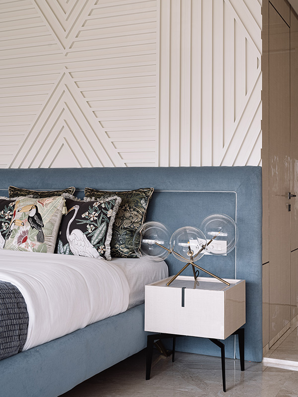
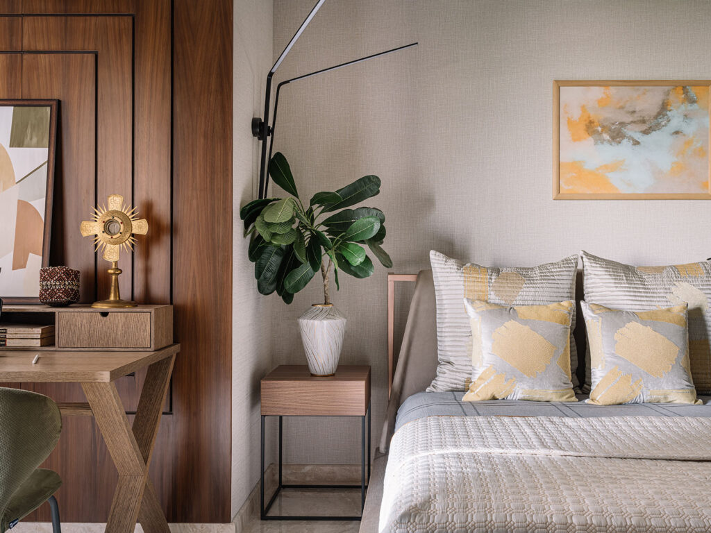
Agarwal painstakingly distinguished Project Crest and cracked the neutrality of the space through its walls in juxtaposition with the European furniture and Indian accent pieces. The master bedroom’s wall dominates a veneer paneling behind an Arketipo bed in the company of clustered lights dangling from the ceiling, while a corner Ingo Maurer’s butterfly chandelier augments a dreamy allure to the backdrop of the daughter’s bedroom that is outlined in ombre finish wallpaper featuring hues of pink, from darker to lighter gradients. A combination of acrylic and ivory paneled wall forms the primary colour palette of the second bedroom in contrast to the sophisticated guest bedroom that engulfs a chic wooden framed Shake bed and leather backing and a wall-mounted two-armed light study table.
It was an easy victory for Agarwal to work on the 3,800 sqft raw site which had been slated to be finished by July 2020. Alas, just like the world, Chestnut Storeys faced the challenge of the COVID-19-lead pandemic and the first lockdown in the country. Elaborating on the awful delay, Agarwal says, “We didn’t face any challenges from the client’s or the builder’s end. We didn’t have any such challenge, except COVID. The house was almost ready and we were targeting July-August 2020 for completion but the lockdown in March delayed our final finishes till September 2020. The client trusted us completely. He was eventually happy that he didn’t get too involved, and not once did he say the changes are out of his comfort zone or he doesn’t want it,” cites Agarwal, who masterfully delivered an eclectic home that resonated with her client’s personality.
‘
Tags
- Moooi
- Arketipo
- Rugiano
- The Fishy Project
- Ingo Maurer
- Cole & Son
- contemporary home
- COVID-19
- De castelli
- Chestnut Storeys
- pandemic
- Souk
- Farah Agarwal
- lockdown
- Project Crest
- Ishita Sitwala
- European furniture
- Shake Design
- Indian artwork
- Meridiani
- Baxter
- Porada
- Boca do Lobo
- Chennai
- ombre finish wallpaper
- Fendi
- Interior Designer
- Shake bed
- Koket

