A Peek Into The Sophisticated Madness of This Delhi Office
- 25 Jul '18
- 9:30 am by Payal Mohta
Whether you have a conventional desk job or a flexible freelancing lifestyle, most professionals would agree that monotony has a way of creeping up and staying constantly inspired can well become a mirage.
Studio Bipolar, a Delhi-based design consultancy is well aware of such perils. So when American men’s magazine, Esquire wanted an administrative office for their nightclub in the capital, Studio Bipolar made sure that their design remained a source of unfailing ingenuity for their clients.
Located in Delhi’s Defence Colony – a neighbourhood for upscale restaurants, cafes and stores Esquire’s office is designed by Studio Bipolar’s head architects – Ujjwal Sagar and Sanjana Mathur. Using the aesthetic elements of the Art Deco era space acquires a vibrant character of both quirk and minimalism. A rare guest in the country’s formal offices.
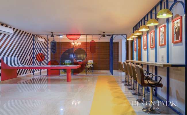
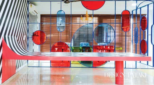
The most striking feature of the space is the use of a quintessential Art Deco colour palette – Sunshine Yellow, Ruby Red and Royal Blue throughout the office furnishings including wall panels, lights and even the furniture. Elements like a yellow tinted frameless glass table, for the boardroom, which reflects the patterns formed around it lends a sense of warmth to a space, which is usually associated with formality. “We embraced the idea of primary colours being used in the interiors to act as a catalyst for dynamism in the mind-set of the users,” says Sagar of his bold design decision.
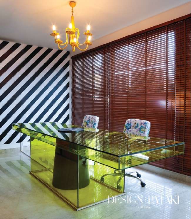

Art Deco also became the reference era for Studio Bipolar because of its integral connection to their clients itself.
Esquire emerged in the Art Deco era when traditionalism gradually converted into modernism. The prime elements of this school of design were arches and asymmetrical shapes. “The office had to be a reflection of these parameters in a single connected space,” says Mathur of her initial vision for the site.
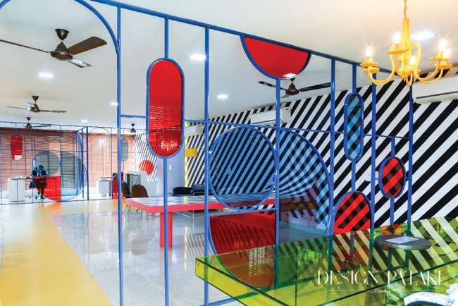
So the large area of the office was divided into individual and yet porous sections through ‘punctured partitions’. This innovative design element is composed of slim metal plates bending to form simple geometric shapes which are fitted with tinted glass pieces. A contemporary twist to the stylistic features of the Art Deco era these structures gives both connectivity and linkage to the nightclub owners and at the same time provides a provision for privacy. Further lending a ‘kinetic touch’ to these partitions is the black and white striped wallpaper of the office which elongates the space.

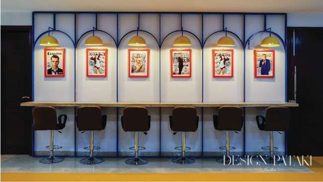
Another thematic and yet functional working space in the office is a high table resembling the look of a bar counter whose supporting wall is highlighted by framing iconic Esquire covers on it. This reinforces the evolution of the brand image of the magazine throughout the office while still being rooted in the Art Deco era.
“The concept directed by our clients was ‘sophisticated madness’ and so we stuck to that,” agree both Sagar and Mathur when asked to sum up the many diverse design influences of the project.
And so the users of Esquire’s office can be rest assured that for them, design will seldom allow a dull day to pass by.
Photograph Credit – Suryan Dang

