Facade Goals – Design Pataki’s Top Picks For the Month
Self-transforming honeycombs, deconstructed cube punctuations, and undulating brick jaalis – a statement facade can elevate a project from the very first impression. These are architectural feats in themselves that take into consideration everything from outdoor pollution to weather, serving both utilitarian and aesthetic purposes in equal measure. For this piece, we’ve dipped into the Design Pataki archives to bring to you some truly remarkable examples of facade design –
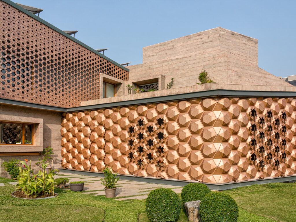
Designed by Ahmedabad based architects – Open Ideas, this structure is a bold example of India’s foray into artistic engineering. Hive, as the name suggests, consists of a hexagonal patterned facade inspired by honeycombs and carbon crystals. The solar energy capitalised by the plot was studied for an entire year before strategic decisions on the design of the house were made. Cloud cover, humidity, external dry bulb temperature, shadow patterns and various other aspects were studied extensively before the design could be finalised. With metal being the primary material, a long span, lightweight, complex form of structure was envisioned that also ensured fast construction. The architecture of the house is expressed as an angular V-shaped structure oriented towards the green pockets spread around the house. Read more here.
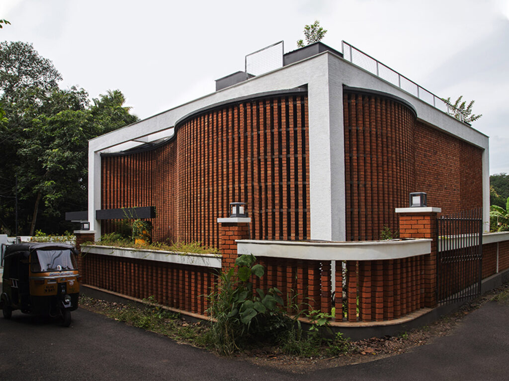
In the face of fleeting trends, what truly stands the test of time is thoughtful design which takes into consideration the circumstances within which it exists. For architects Clara Rose Jose and Jose K Matthew of Foundation F.L.O.D and JKM Design Consortium, the context in question was a barren plot of land with roads on three sides, in an especially humid location.
Marrying the rusticity of exposed brick with an undulating, modern silhouette, the exposed jaali wall of the courtyard affords some much-needed privacy to the bedrooms and living areas, while also allowing for ample cross ventilation. “The design is an outcome of challenges and constraints,” says Matthew, principal architect at JKM Design Consortium. “The construction of the outer brick jali wall was a challenge and could proceed only very slowly because of its lean nature. However, the undulation makes it more stable. The wall provides wind and air into the house, and at the same time protects the residence from the western, eastern and southern sun.” Read more here.
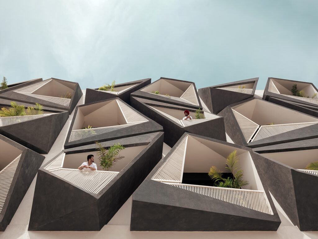
The ‘Never Never Cube’ by Chandigarh-based Studio Ardete is a masterpiece in commercial architecture that plays with the idea of animating an office building into a vivacious and interactive working space. Inspired by Le Corbusier’s iconic façade treatments throughout Chandigarh, the sculpture-like ‘Never Never Cube’ amplifies its individuality by highlighting its double-skinned façade. Lined with various angular pop-outs in the form of deconstructed cubes, the building makes its balconies flirt with the line that differentiates art from architecture. The structure breaks the monotony of regular geometry and makes its balconies act as private niches for the inhabitants that spark captivating connections between the inside and the outside. Read more here.
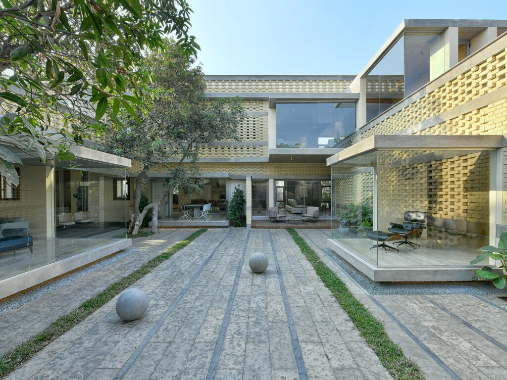
The Brick Mask House designed by SpaceFiction Studio works with nature to become a striking backdrop to its forested surrounds. Moving around, whether inside or outside, one is treated to a multitude of ever-changing experiences. At the very heart of this home is an open-to-sky courtyard around which the home is gently wrapped. Glass projection boxes looking out onto abundant greenery protrude from its brick façade, keeping the homeowners in constant contact with nature.
Peripheral walls made up of local wire-cut adobe bricks with interjecting layers of exposed cement lintels characterise the structure. By controlling the perforations, depending on the space it divides or encompasses, the team was then able to harness the changing of light with the progression of the day. When lit by the sun, the perforations cast shadows inside, and when back lit, they reveal a hint of that which happens behind them. Read more here.
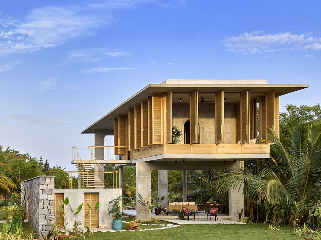
Architects Shalini Chandrashekar and G. S. Mahaboob Basha of Bangalore-based firm Taliesyn- Design and Architecture envisioned this home in rural Bangalore as a built environment that would belong within its context – one that would blend and harmonise, rather than shock and dominate. The two storeyed residence is an interplay of volumes and voids that frames the views of the farms that lie on the horizon. Resting weightlessly on a set of two loft, bevelled arches, it creates expansive column-and-wall free spans with deep overhangs.
Named Ksaraah, the house is an architectural symphony of volume, light, shadows, and textures, which are in a state of constant change influenced by the time of day and their specific functions. The louvered facade alters the spatial quality of the interiors with every passing hour. Read more here.
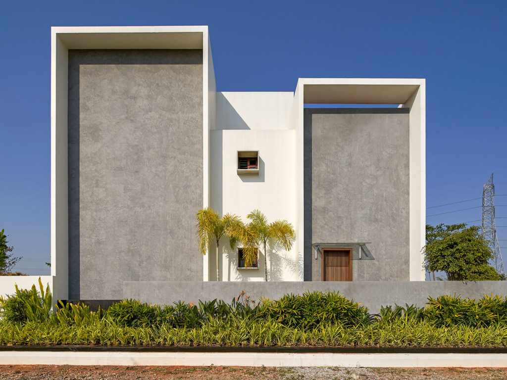
Inside of a gated community in Bangalore sits a gray and white house designed by Crest Architects. Minimal yet striking, this clean white and concrete grey facade complemented beautifully by the green landscaping that skirts it. The abstract shapes and geometric designs are reminiscent of the Bauhaus movement in Germany. The visual appeal of the house is holistic and uses natural light beautifully. Read more here.

