#AirportDiaries – Unconventional Optic Store Design
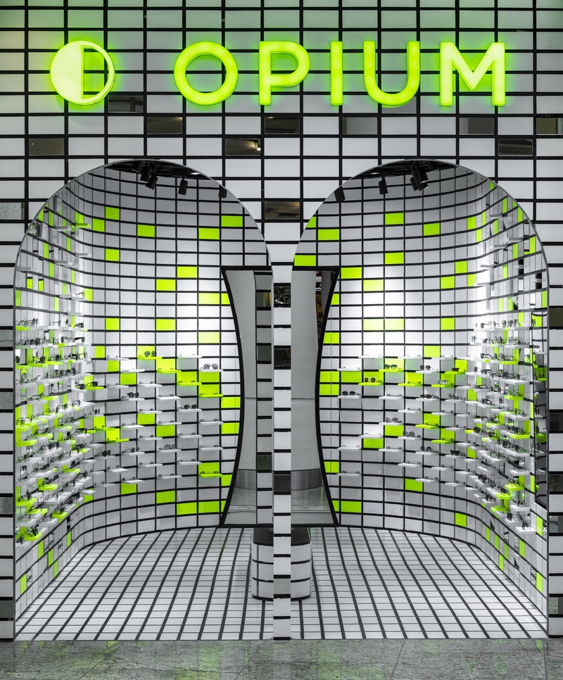
A small space of 215 sq.ft, inside Mumbai Airport Terminal 2, was to be designed as a retail store for the eyewear brand, Opium. The client approached Renesa Architecture Design Interiors Studio, a New-Delhi based firm, to conceive an eye-catching design, one that would make a bold statement. “The client wanted something really bizarre, something so simple, yet so intimidating that it captures each and every possible traveller for a second more than the other stores,” informs Sanchit Arora, the Head Architect at Renesa Studio.
The design of the store had to be conceptualized keeping in mind the irregular shape of the compact plot. Arora worked out a series of sketches to determine the spatial layout as well as the façade design. “The initial sketches started with the development of the funnel shape planning with the disfigured mass behind becoming the storage space and hence defining a flowing pattern for the retail path to the consumers coming in. The facade sketches show the different identities and ideologies that were thought about to create the funnel illusion as well as add brand identity to the store,” informs Arora. Along with developing the design concept, the layouts that were tried out also helped in resolving movement patterns, where the product displays would be, placement of the storage room and determining how the space usage could be maximized.
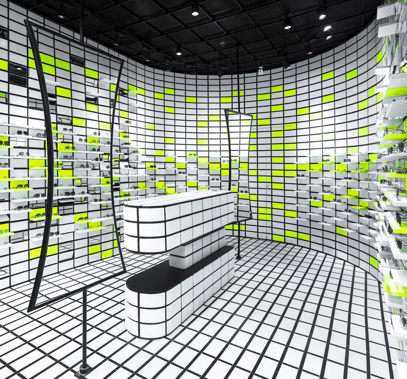
The final layout is uncomplicated, making efficient use of the given space. A simple gesture of placing a U-shaped wall defines 3 sides of the store while the front exhibits a double-arched entrance with the brand name ‘Opium’ displayed in a striking neon signage above. The remainder of the space at the back of the store has been designated for storage. Two large pivoting mirrors with the cashier’s desk in between them have been strategically placed in the centre, establishing a clear and streamlined pattern of movement for the guests within the store.
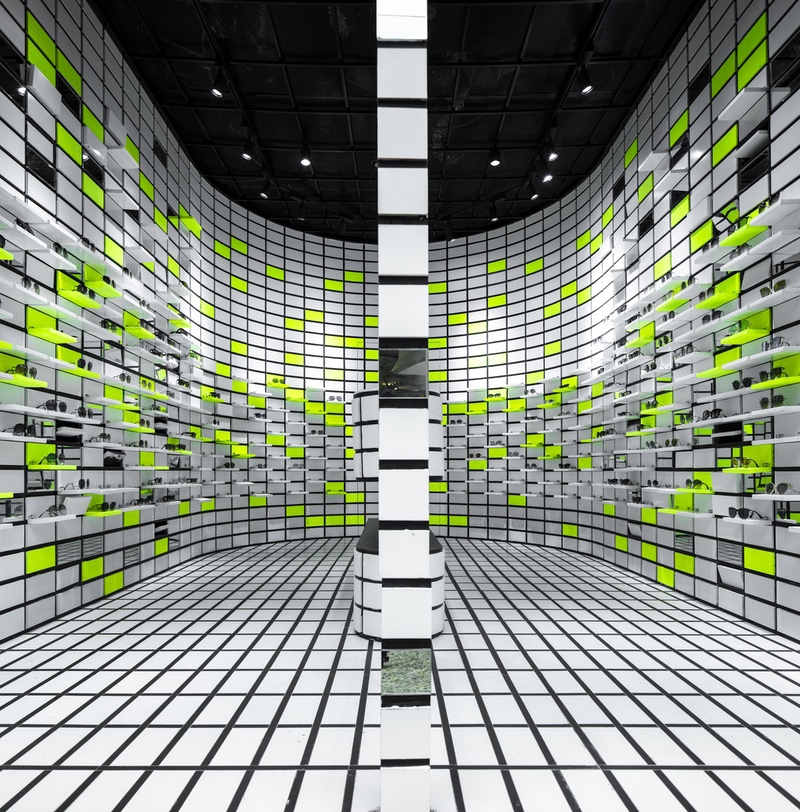
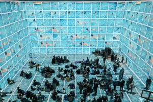
Opium’s interiors are enveloped in a consistent pattern of 8×4 inch grids that dominate not just the wall and the floor, but even the cashier’s desk. This repetition has resulted in a strong design language. Random grids within the wall feature attached display shelves – the flip-flops. These shelves have been attached via hinges and each eyewear product is perched on each individual shelf, allowing customers to easily access them. Arora further informs us that the inspiration for the grid pattern stemmed from ‘Optical Art’ that essentially employs visual elements to provide a sense of optical illusion. The door to the storage room at the back is smartly camouflaged by seamlessly continuing the gridded pattern over it.
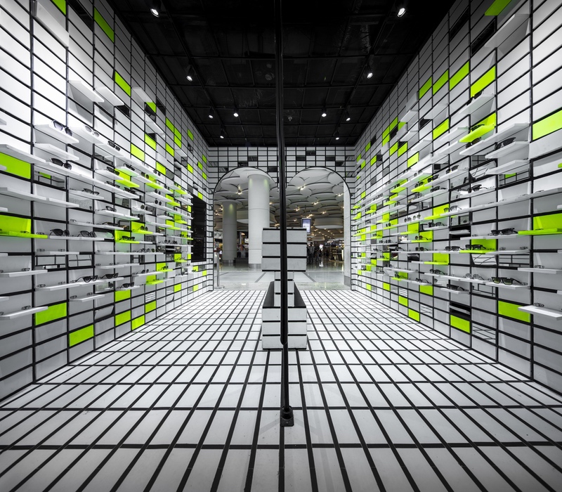
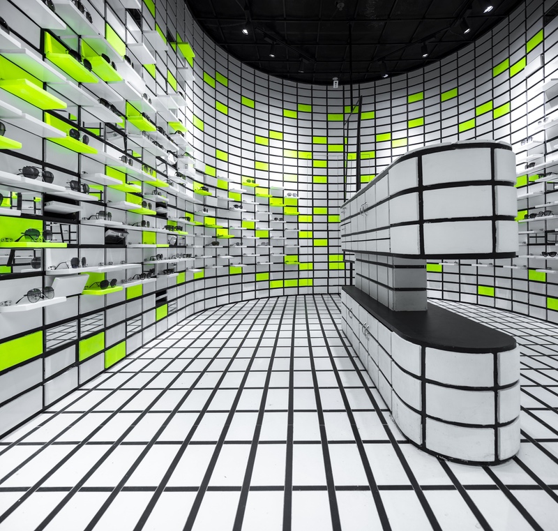
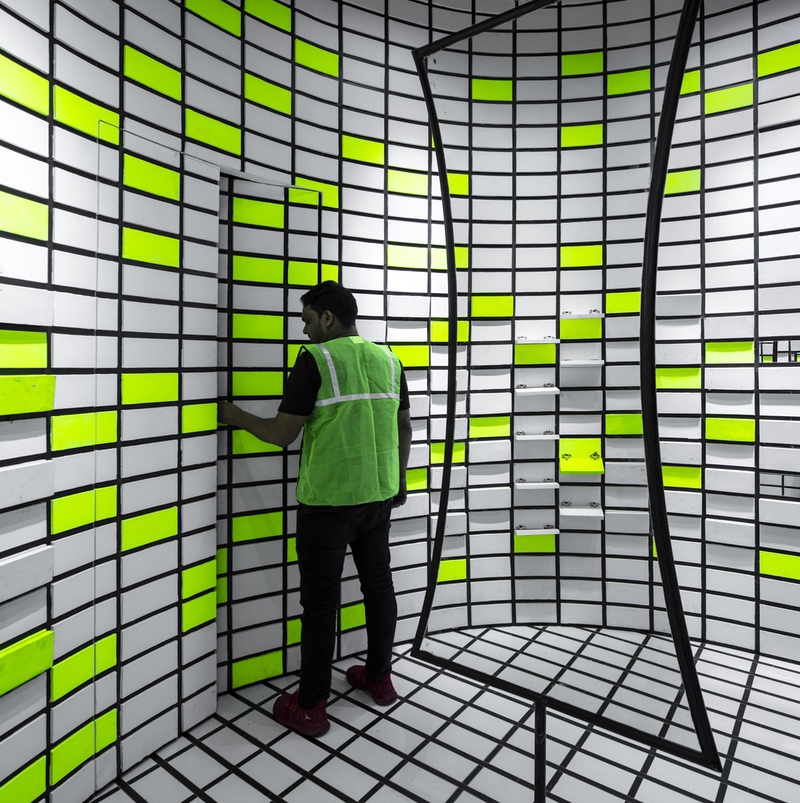
On the wall, the monotone palette has been paired with the Chartreuse colour, a striking shade that is 50% green and 50% yellow. This colour finds expression in randomly selected grids. Mirrors have been placed within some of the other grids as well. The combination of these colours paired with mirrors, within a predetermined geometric pattern, serves to visually elevate the wall. “The simple idea of creating flip – flops with 8 by 4 inches MDF panels and merging and reflecting through the two pivoting movable mirrors adds to the volumetric play of the interior curvature of the space and helps make the small space look bigger through a simple move,” says Arora.
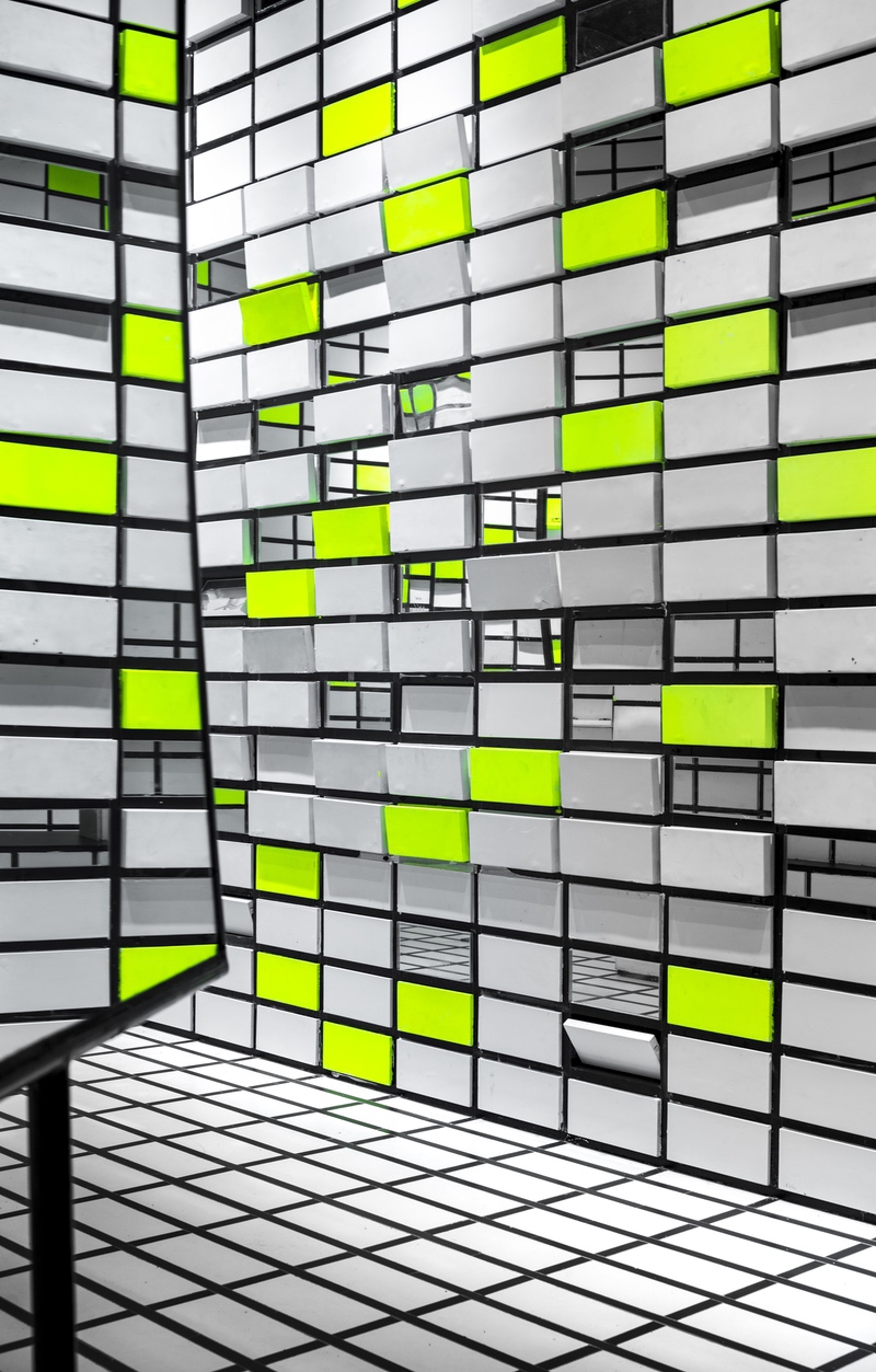
Renesa Studio has steered away from conventional store design, rendering the limited space with a quirk and a distinct identity. With the introduction of the flip-flops, it also serves to provide the customers/travellers with an engaging experience within the store. “The Flip Flop is not merely about designing an optical store, it is to create an ambience in which public space and private space are deconstructed and placed in the same field to maintain a strong visual character,” concludes Arora.

