This Ahmedabad House Creates A Tactile Narrative Through Kota Stone And Timber
With platforms like Instagram and Pinterest providing inexhaustible supplies of design inspiration, the last few years have resulted in far too much importance attributed to the visual appeal of a space, while tactility and functionality have taken a backseat. However, the VS House by Sārānsh is an archetype of modern Indian interior design. Neutral colours and minimal accessorization form the backdrop to what sets the house apart – an excellent use of locally sourced materials which stimulate the tactile senses. The VS House is a family home on the outskirts of Ahmedabad. Originally a 4 bedroom house built around 7 years ago, it has been restructured by Sārānsh into an expansive 3 bedroom one.
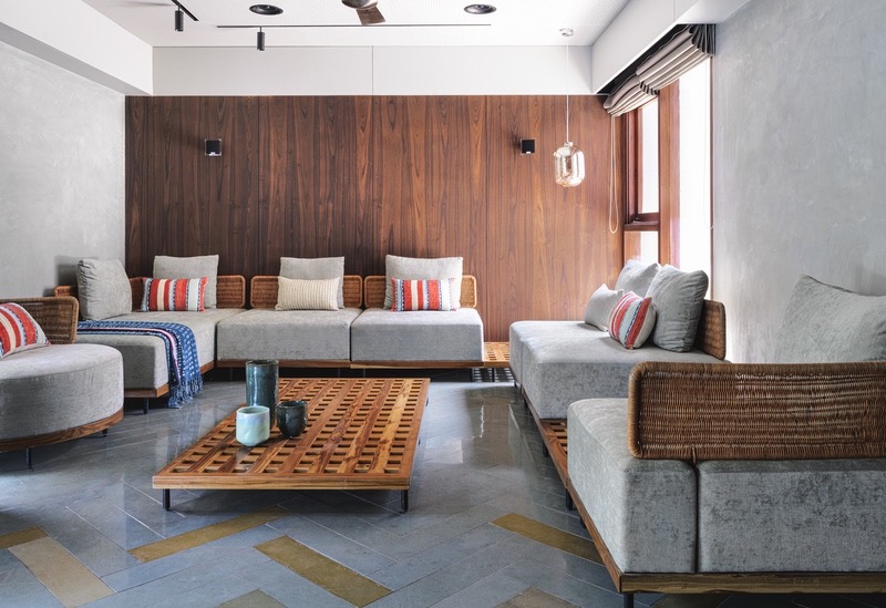
The Ahmedabad based architecture studio adopted a minimalist design approach for the house, emphasising an individual’s sensory journey through the space. “Instead of adding more elements, focus has been given on the nature of the materials used to finish the insides, which create the entire ambience,” says Kaveesha Shah, partner at Sārānsh. What was made to stand out, however, was the Kota stone and wood flooring used in a variety of patterns throughout the house. The leather finished and mirror-polished grey Kota stone forms linear strips in the “movement spaces” like corridors, herringbone patterns in the formal living room, and large squares in the informal area. The bedroom floors feature wood inlays within the stone floor, while the kitchen sports a seamless polished surface. “Considering an Indian home, where one would be moving barefoot a majority of the time, changing the finishes of the floor also helped us define this journey. Like the thin strips of Kota stone turning with the corridors where they give a sense of directionality, beside the large chunky slabs of it in a seating area which helps one slow down,” Kaveesha tells us.
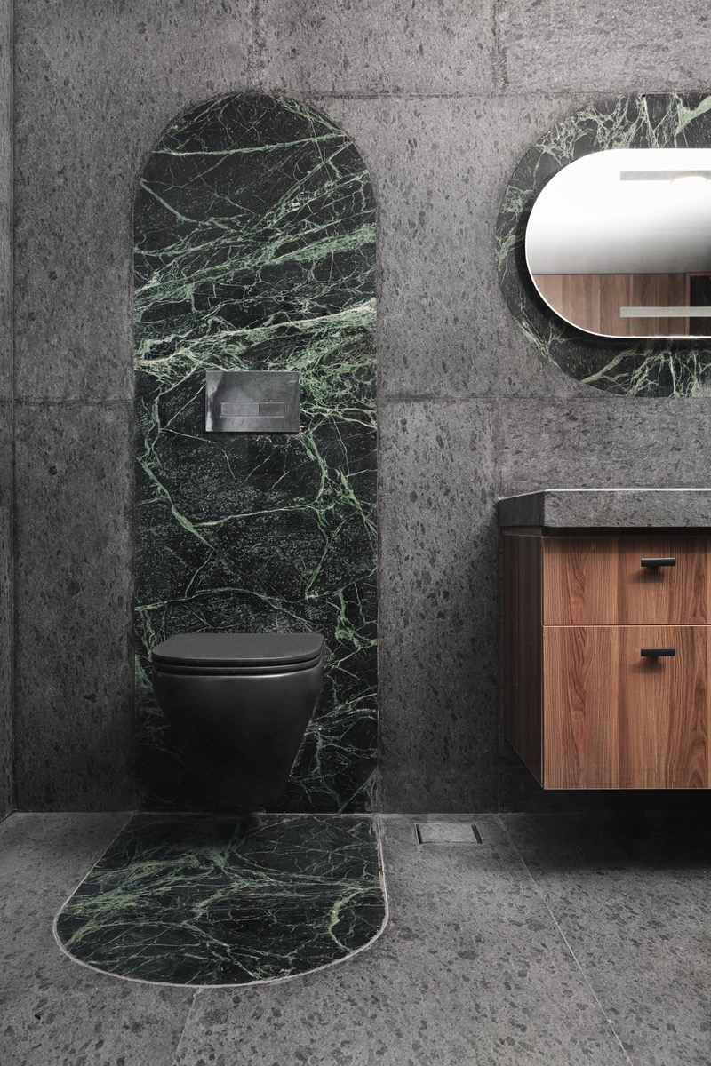
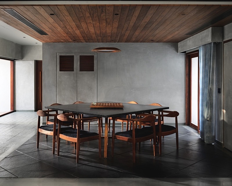
Stone and timber form a powerful visual narrative that runs through the entire house – varying in degrees of proportion. The dining area features a colour palette darker than the rest of the house with a diagonal leather finished black Kadappa floor, matching black tables and chairs, and a warm-hued timber ceiling. “The study and the courtyards have a higher contrast with a warmer tone,” says Kaveesha. “The courtyard has a herringbone pattern of fire bricks while the study has a complete wooden floor.” This conscious interplay between materials extends to the bathrooms as well – while flecked grey tiles cover the floors and walls, veined, emerald-coloured marble backs the fixtures.
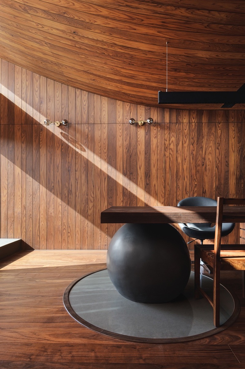
Bathed in sunlight, the study created by Sārānsh on the first floor of the house was originally a large passage with a terrace next to it. “We believe the study is the most noteworthy feature of the project,” Kaveesha tells Design Pataki. “It is the heart of the house. Considering it was just a movement space previously, with a service terrace along with it, it was one of the few areas where we could actually design the space from scratch and not be constrained by the existing structure.” Half its roof was created from scratch in metal, allowing the curved ceiling to open up towards the light. As it faced east and was located along the way to the master bedroom, the studio felt it was the perfect opportunity to bring in the morning light in a dramatic fashion. Envisioned as a “wooden box”, the study is one of the warmest spaces in the house. The aim was to emulate a toasty den-like atmosphere, isolated from everything else.
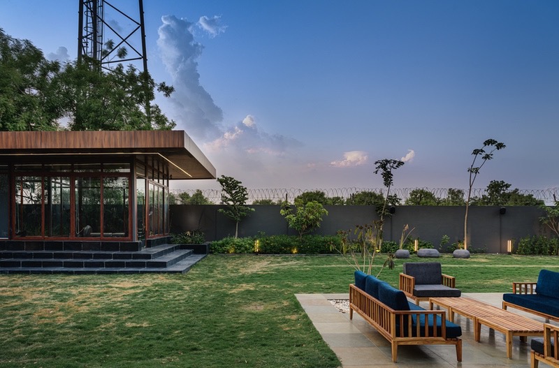
Being a corner plot, the VS House has an expansive outdoor area – allowing Sārānsh to create four separate seating areas outside, apart from a gym. These were finished in materials similar to those used in the interiors. Sleek wooden strips covered the jacuzzi deck, while the verandah beyond the formal seating area and the terrace outside the main bedroom were finished in a grey Kota stone. Lastly, the larger seating area near the courtyard finished with brown Kota stone. The firm made a conscious decision to lower their carbon footprint by allowing the availability of materials in the area to guide their design. Local materials informed the entire palette for the house, and a majority of the wood used in the project is reclaimed. “Our attempt with this project was to create a simple yet effective set of spaces, which act as a stage for a play of light and shadow while allowing the materials and finishes to be the protagonists,” says Kaveesha.