A Pune Home That Blooms Under A Skylight
The project ‘House Around the Skylight’ tackles clutter by adding concealed storage space and toning down the color palette of a family home in Pune. As a way to build a language and bring coherence to this home, the duo Satyajeet Patwardhan and Pashmin Shah at Amoeba Design stick to the bare minimal aesthetics of cement, wood, and brass. The overarching themes of this design are post-modern meets minimalist.
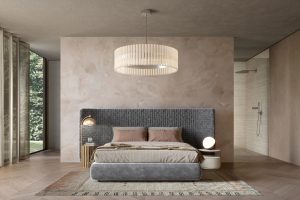
Every home comes with its own story. A place that has been lived in will collect objects and memories that can become hard to let go of (regardless of what Marie Kondo might have to say about letting go). “It’s honestly part of Indian culture to hold onto objects for a long time,” says Patwardhan. “However, it makes for a very sustainable lifestyle because we tend to repurpose objects and use them for as long as possible before discarding them,” he adds. Using this as a starting point for their renovation project Amoeba Design developed an artistic language within the space. In many parts of the home, they have added closets and storage cabinets to bring texture and volume. For instance, in the master bedroom, there is a curved hollowed-out wall above the bed–and in place of brick, they filled the wall with cabinets in dark grey which have been customised in-house by Amoeba Design.
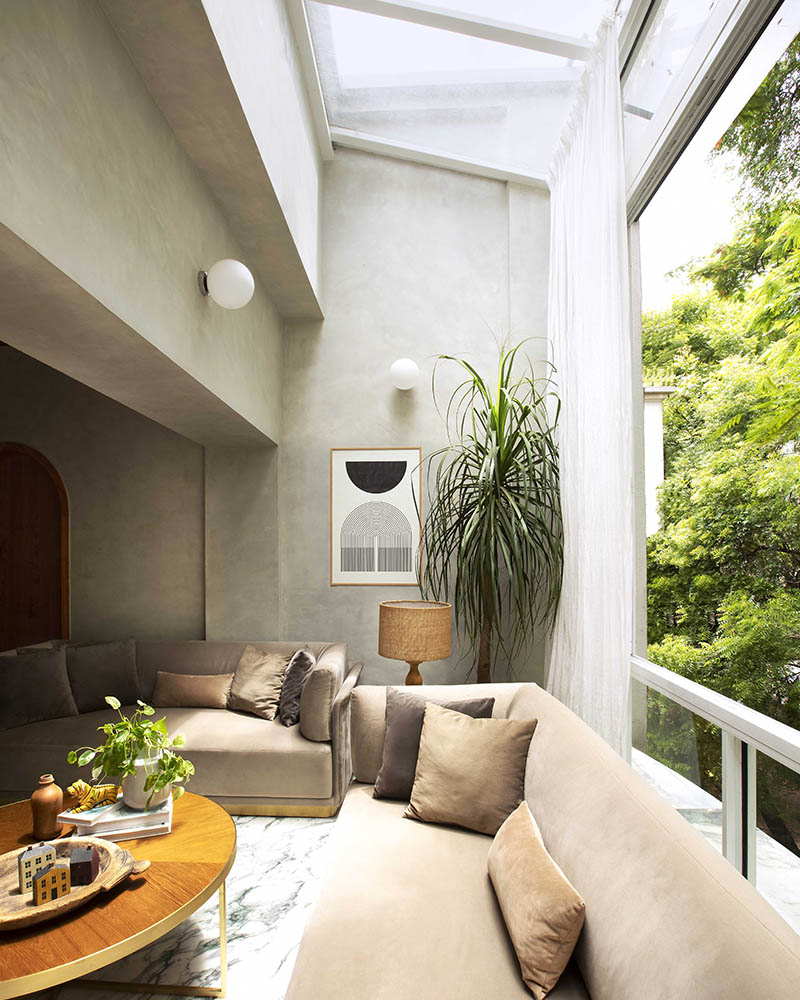
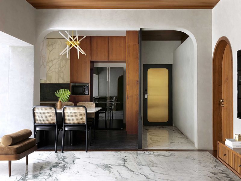
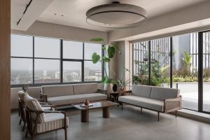
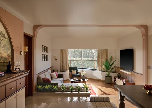
The house was bright-colored and dimly lit before, but after the renovation, it is neutral-colored and brightly lit. By turning core design elements of this project on their head, this renovation project works very well to center the needs of their client- a touch of class with the feeling of the home kept intact. The exaggerated curves in the living room, the long lines on the ceiling walls, and the wooden cabinets work very well to make it appear more spacious. A striking feature of this home is the addition of a skylight in the living area. By merging the balcony and living room, Shah and Patwardhan make it more expansive. The fact that the house is located on the third floor (right under the terrace) worked to their advantage because the architects were able to raise the ceiling of the terrace to match the height of the overall building. This change not only increased space but also brought in a lot of natural light. As a result, they now get an unobstructed view of the trees that surround the building. They also opened up the kitchen next to the living room to turn it into a more communal space.
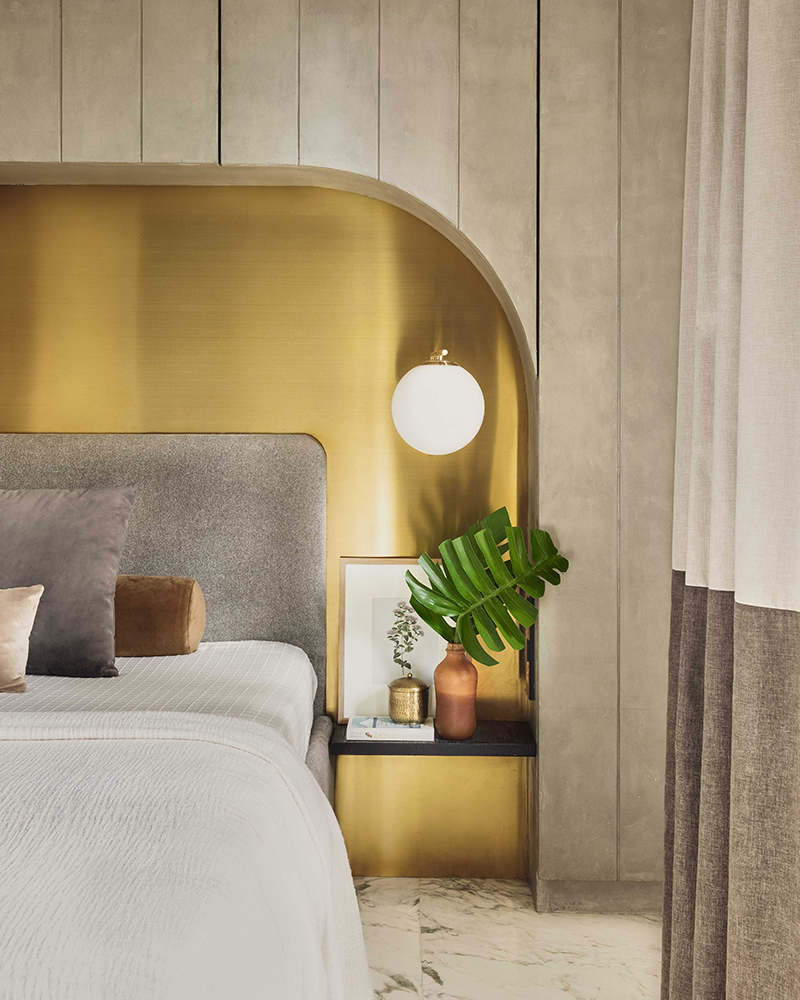
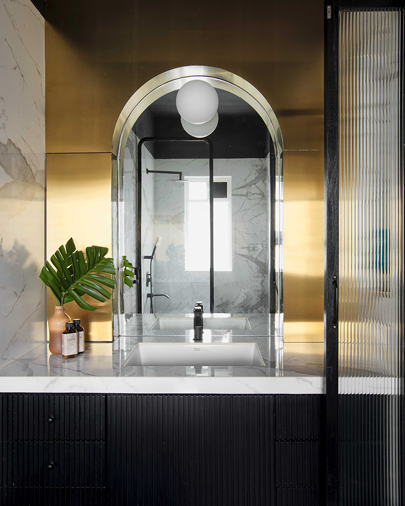
“A place that doesn’t scream wealth but doesn’t shy away from the gloss either,” was the brief given to them.
“To create a sense of a ‘home’ that aspires ‘class’ and to accommodate all the storage requirements was a challenge for us because our sensibilities lie in extremely simple, rustic, and earthy aesthetics,” says Patwardhan.
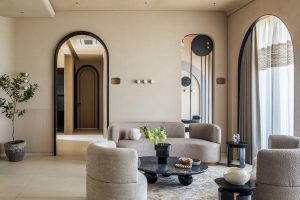
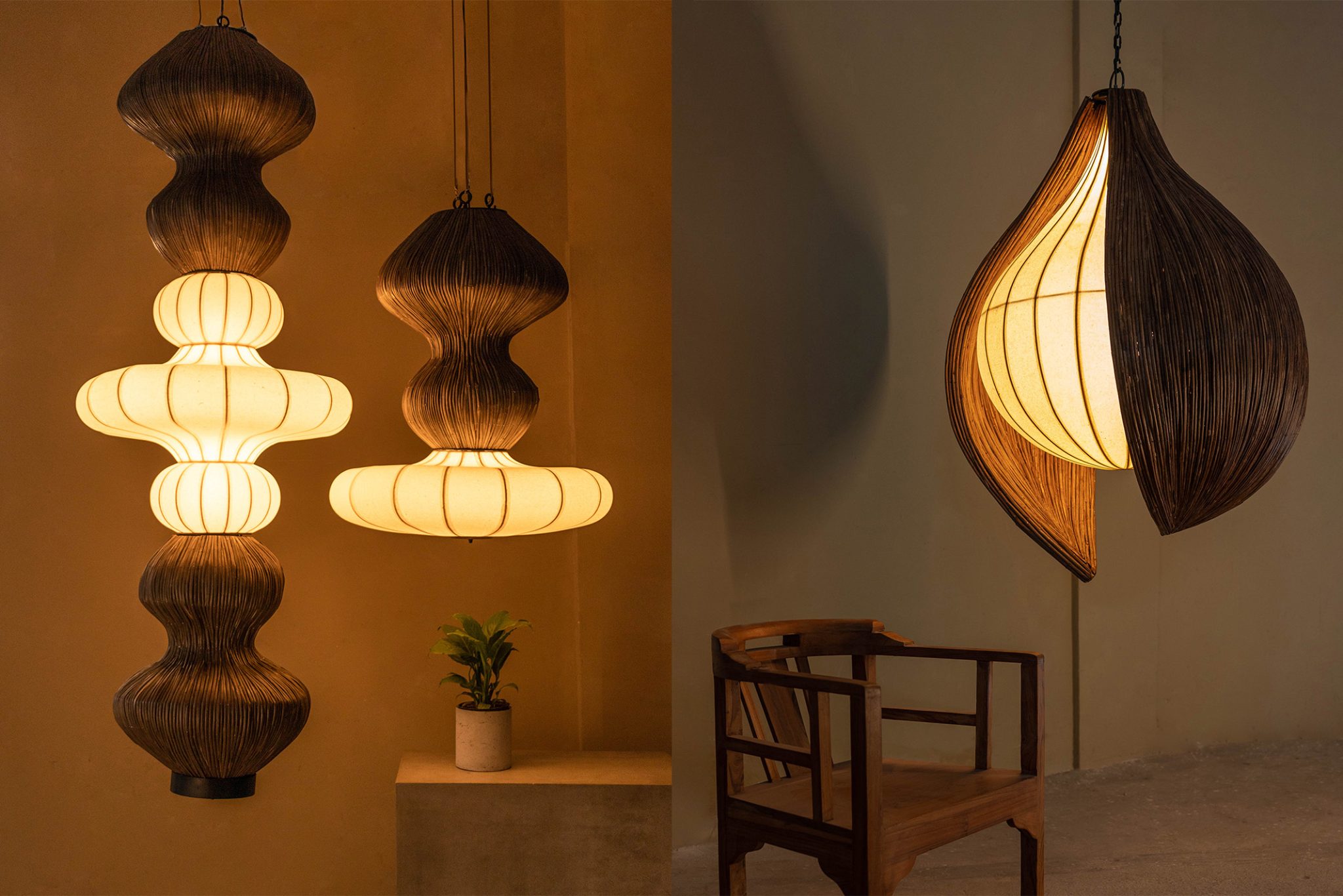
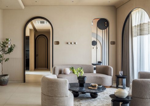
After tackling the storage issue, their sensibilities do come across in the interior design of the space. It is minimalist and centers small objects like earthenware, plants, and non-intrusive furniture against neutral-colored walls. They also use a generous amount of brass to bring in pops of color to the home. The bathrooms have a subtle sense of Art Deco aesthetics of layering contrasting shapes against bright colors and strong horizontal lines. For instance, the soft-curved mirror in the guest bedroom or the very modern chandelier in the dining area hints at decadence and class aspiration from the client brief.
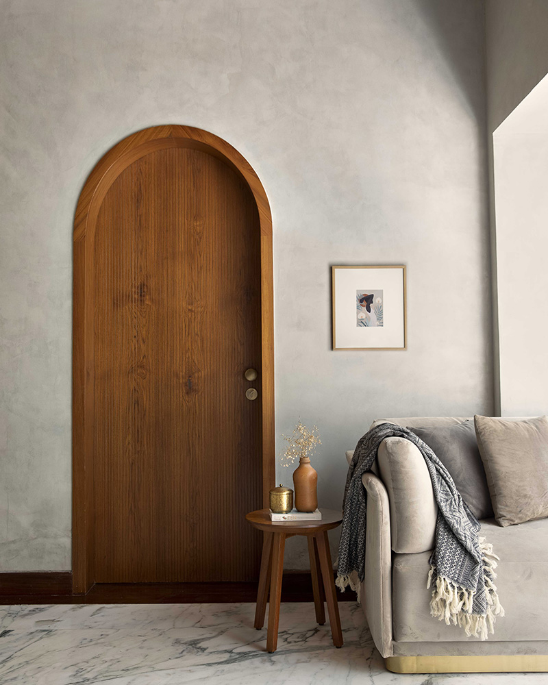
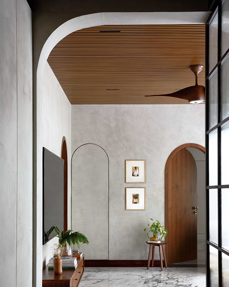
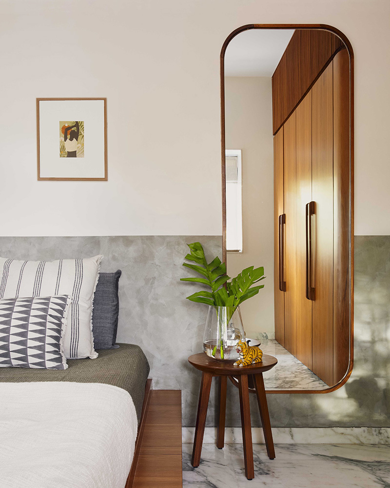
No matter how much one ‘classes up’ a place or rebuilds the layout of a house, it can only feel like a home when the people who live there can enjoy it. While some of the mid century art in the home has been found on Etsy, Patwardhan tells us that they deliberately left many of the walls blank and some parts open so that the family could fill them, over time, with their own artistic choices. He also says the biggest compliment they received was from the mother-in-law who lives there. She admitted that even without the children, the newly renovated space felt like home.

