-
1
Nov
'12
-
6:40 am
by
Crew
 |
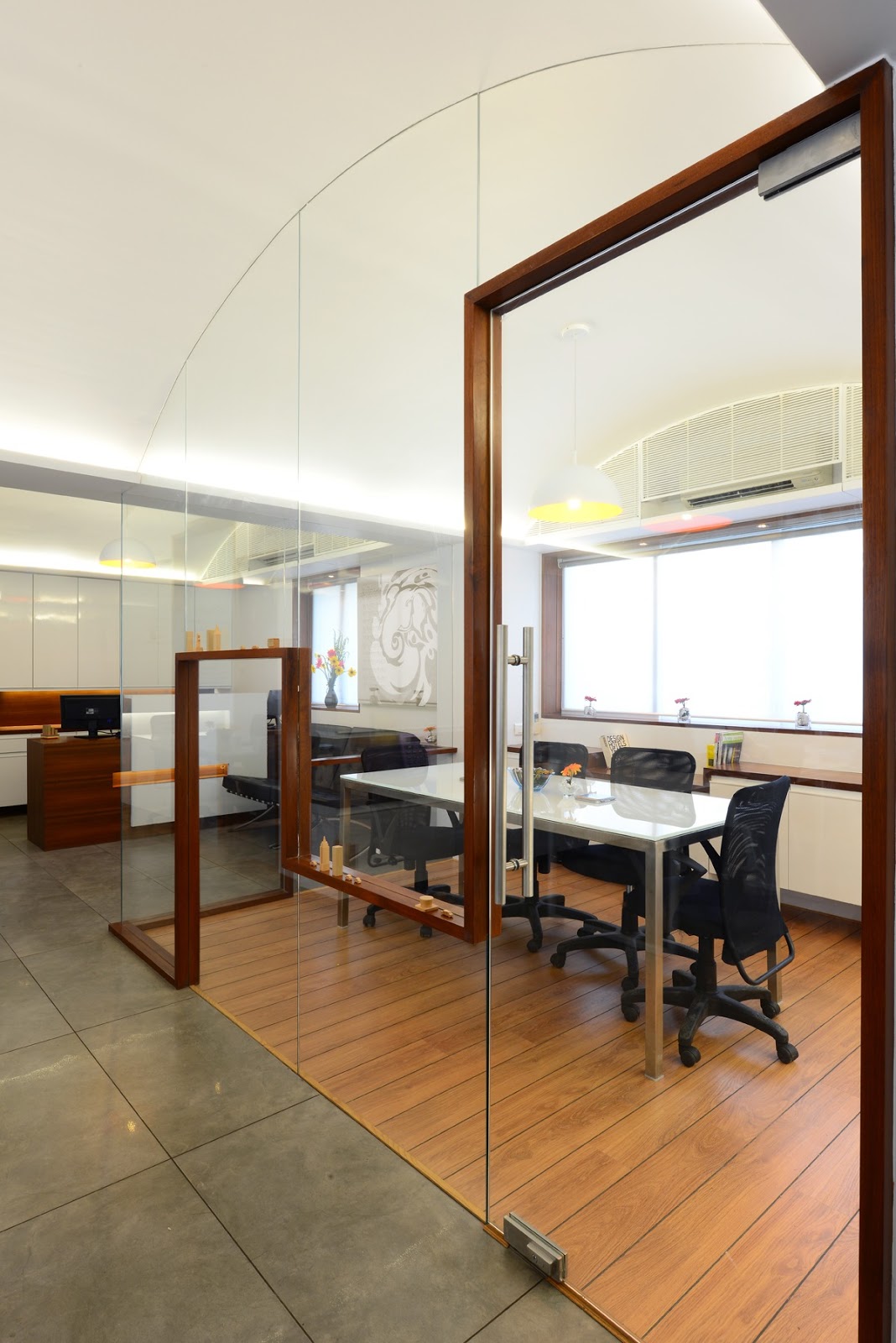
| Looking at the Conference and Entrance door |
Bhaktawar Realtor’s, Mumbai spanking new office by
Jugal Mistri &
Rahul Mistri of
Blank is an interesting blend of aesthetics. The integration between the pockets of spaces. The compactness and functionality for a small office. Lastly the inspiration behind the design elements. “Being a very cut up space, converting it into a fluid space was difficult” says
Jugal Mistri. Covering the beams dropping at random intervals was important. Instead of lowering the height of the space with a flat false ceiling, curving the ceiling gave him an opportunity to maximize the height where possible.
Bhaktawar Realtors are into real estate & their sister company
RNB Cars rent out luxury vehicles. Taking inspiration from a city seemed perfect. New York’s skyscrapers winds through the office. You can see the design elements when you enter itself with the door frame. The conference room is see through with the timber frames forming the skyline. Even the storage has been designed with that kept in mind. We wish he had created a silhouette or a graphic so we could see his inspiration more.
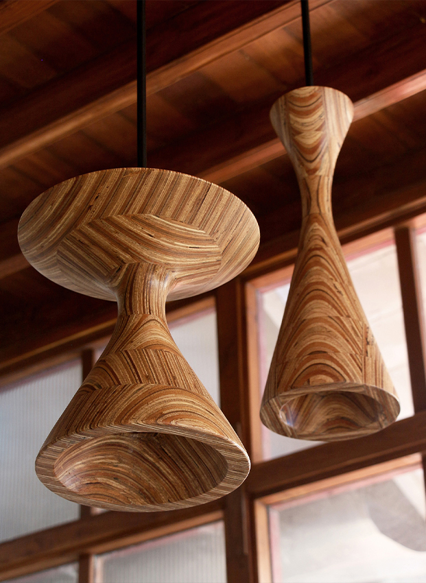
We like the pendant lights from Phillips. With the yellow inside it just adds a fresh look with the white interiors. A chrome finishes is also available. Paying attention to detail by keeping with the white furniture the fittings are PU (Polyurethane) coated. Creating a seamless look between the furniture and fittings. White powder coating can yellow after a period of time, so PU is a more durable but expensive option. The directors cabin has the city line elements moving on the sides of the walls. A textured paint on bison boards. The directors restroom has a dark vitrified tile with a metallic tone. A stark white corian counter for the basin to blend with the white basin.
 |
| Entrance Door |
 |
| Reception Area |
 |
| Conference Room |
 |
| Inside the Conference Room |
Most of the office is in a grey vitrified tile. A break in flooring is seen in the conference room. A light laminate wood flooring has been used. Creating a cozy atmosphere. We ask
Rahul Mistri why we cant see any fittings on the glass partitions in the conference room. He reveals that the, “The glass in the conference is seamlessly flushed with the false ceiling. The glass has been fixed in the slab and the POP created over. Hence giving a very clean slick look.” White back painted glass instead of white boards has been used on the tables and walls. The office staff loves that they can scribble anywhere. As always we love the environment angle, it saves paper!
 |
| Work Space |
 |
| Directors Cabin |
 |
| Directors Restroom |
 |
| Office Layout |

