#DPExclusive- This Modern Penthouse In Mumbai Is An Elegy To Organic Materials And Embossed Surfaces
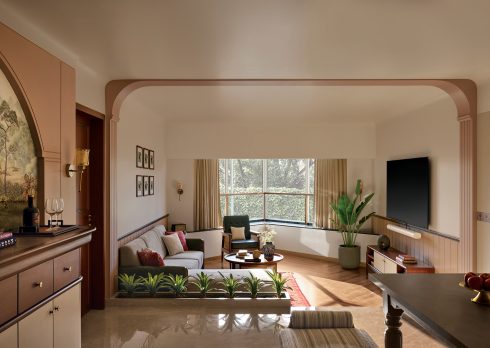
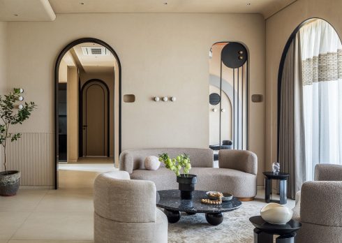
A behemoth of uninhibited spatial geometry, adorned with lustrous accents of stone and oak, this penthouse in Mumbai epitomises a deep-seated love for authentic construction. Composing an elegy to organic materials and embossed surfaces, the poetic visionaries at reD Architects transmuted what was meant to be a 5-bedroom home into a triplex with an opulent double-height volume in the living room.
The co-founder and principal architect Ekta Parekh, kept a creative synergy with the homeowners, “This abode for a family of four, who came from humble beginnings, is filled with original objects.” In a continuing dialogue between past, present and future, the accents and niche artefacts have been procured from high-end Italian luxury ateliers such as Minotti, Cassina, and Moroso. The globetrotting homeowners have also added their treasured memories to this eclectic inventory, augmenting the multiethnic visual allure with souvenirs from independent showrooms.
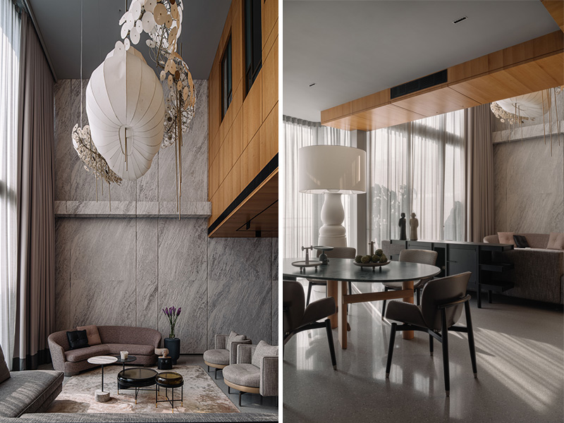
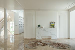
This 4500-sq. ft. mirage embraces an almost postmodern sensibility in its bold, clean lines, and open-plan spaces, yearning to break free from time-tested stereotypes. “The material palette has been kept consciously monochromatic,” Parekh relays. “And the walls, whether PU or stone clad, all have a grey tone running through them.” The main entrance fans out on the lowermost level, where an ascetic-looking terrazzo floor unfurls as a neutral base elevated by unostentatious styling from Mumbai-based Samir Wadekar. A sculptural chandelier in the living room disperses lambent radiance upon the double-height walls hewn out of Indian stone, their inherently veined appearance lending to the charisma.
A leather-honed finish on the stone renders this grainy, undulating texture that weaves an unmissable tableau in collusion with the mid-century, sinuous couches and carved wooden sculptures.
Also read: Sourcing Secrets With Apoorva and Rajiv of reD Architects – The Office Edit
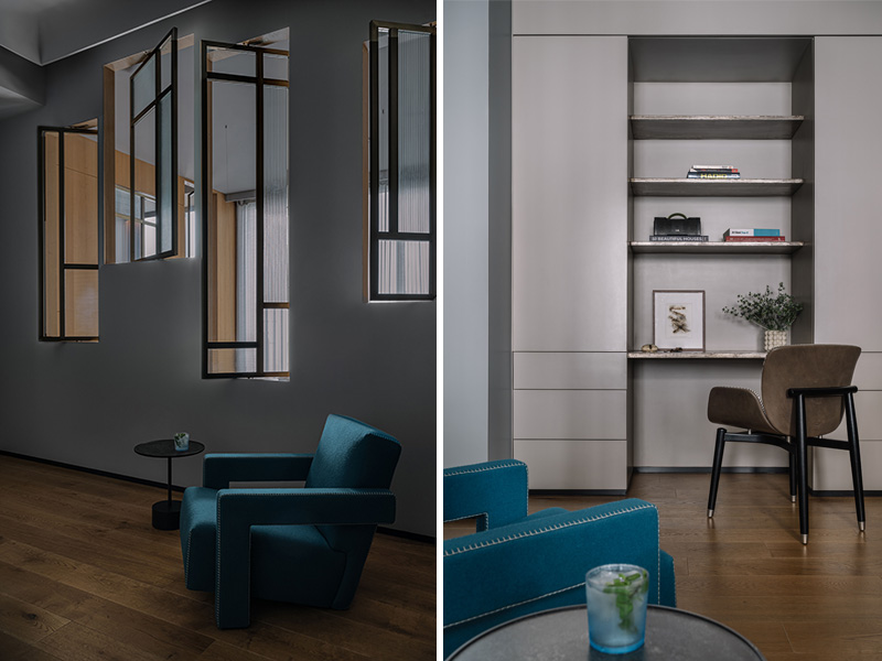
The Malleability Of An Open Floor-Plan
Formerly a kitchen, the den space is now ideal for late-night TV and board game get-togethers over the weekend, hidden from view by stackable in-line doors to preserve an aura of snug camaraderie. The asymmetrical lines of a double seater Roche Bobois couch in this den add significant personality, while the sectional silhouette introduces great freedom of composition. Its mottled, tone-on-tone stitching accentuates the gentle contours and is a clarion call to languor.
The living room spills into an outdoor deck that girdles the dining room. An ingenious service window has been designed and placed strategically to facilitate the uninterrupted flux of tableware between the kitchen and the breakfast table. Guests can choose their perch: a regal Patricia Urquiola stone table or an industrial metal counter with high bar stools by Giorgetti. The latter serves as a snacking nook at this pass-through window, reminiscing upon the self-service diner sophistication with fond nostalgia. The kitchen occupies the position of a former bedroom, claiming easy access to the dining area and shrouding the inner circle from the din of everyday activity milling about them. Meandering down towards the tail end, one finds a serene guest room that balances the personal boundaries of the family while keeping the guests a part of the lower floor experience– a space of conviviality and privacy.
Also read: This Tropical-Style Penthouse Showcases An Old Meets New Design Aesthetic
Subverting the Design Language
The presence of an esoteric, perforated metal staircase that scales all 3 floors, morphs from its skewed dog avatar into a spiral between the upper level and the terrace. The treads and risers cast an evocative chiaroscuro of light and shadows, acting as a magic lantern at all times of the day, seamlessly bringing the outdoors in.
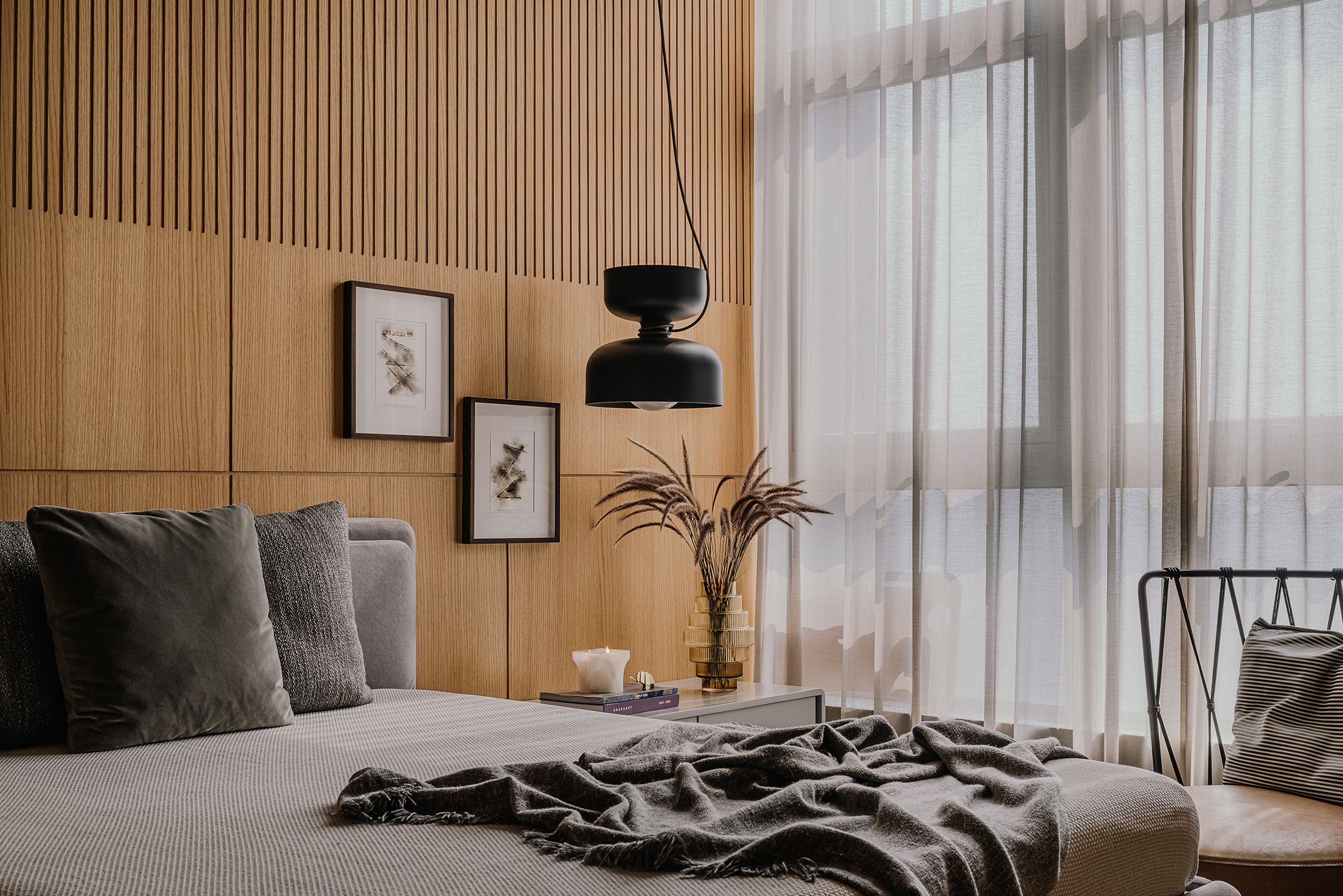
A profusion of glossy, oak-veneered walls juxtaposed with smoky grey PU finish invades the second level — completely flipping the vocabulary from the lower level, but retaining an essence of pared-down subtlety throughout the design language.
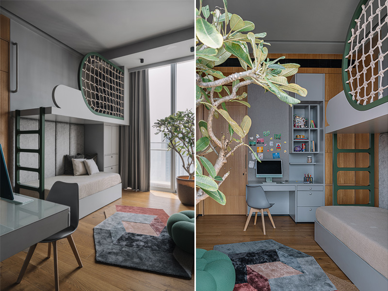
The shared kids’ bedroom is a living embodiment of how some household planters, tones of teal in the bunk bed and a hand-picked ottoman add a fresh design perspective to the largely minimalist home. Created by Sacha Lakic, the Apex Outdoor ottoman by Roche Bobois expresses a rigorous balance between cutting-edge innovation, functionality and emotional design, the specific stretch fabric fitting its round shape perfectly.
Also Read: #DPExclusive – This Richly Textured Mumbai Apartment Was Designed To Be A Dopamine Driver
Elements of User-centred Design
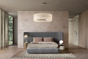
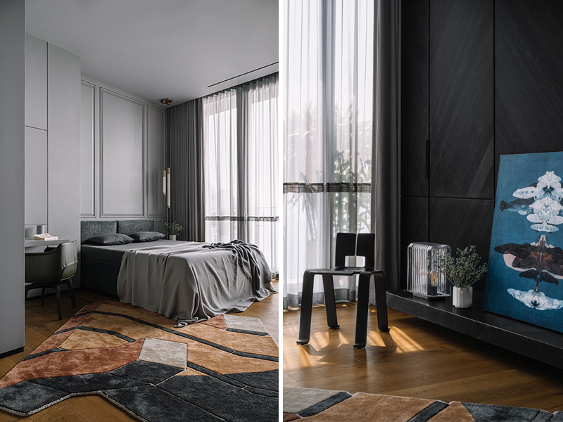
Taking an audacious, site-specific approach to match the bold proportions of the primary suites and the penthouse at large, reD Architects have curated a bevvy of signature pieces from diverse genres, eras, and locations. Dried foxtail bundles sticking out of sheer vases, abstract soft frieze rugs and round corner tables maintain homogeneity, adding colour and hedonistic charm to the spaces. In one of the master bedrooms, a lacquered Charlotte Perriand chair quietly brings depth and dimensionality. Fashioned out of a single sheet of oak plywood, the Ombra Tokyo Chair has been expertly folded and curved to evoke the Japanese origami tradition.
Also Read: The Zen Apartment: An Architectural Gem In The Heart Of Mumbai’s Urban Hustle
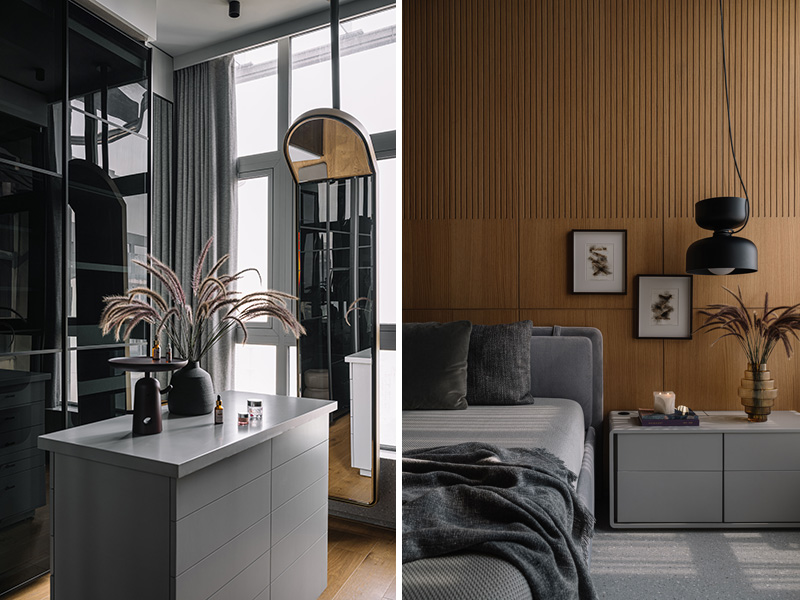
Their walk-in closet, whose splendour is unparalleled, explores a sleek contemporaneity with state-of-the-art storage solutions. Shrewdly segregating the private functions from publicly accessible areas, a multipurpose salon for the family to convene at this level, fulfils a desire for insularity and spending quality time. Early bird yoga sessions or a recreational meets study area for the kids could be some of the myriad uses to which this chamber can be adapted. “Over time it can even be converted into two separate rooms for the kids, as each space is completely self-sufficient,” confides Parekh.
Such ergonomics and shapeshifting are intrinsic to the longevity of planned living spaces, as the family members grow older, their needs and behaviour patterns evolve — affecting how they interact with spaces.
A Tinge Of Hedonism
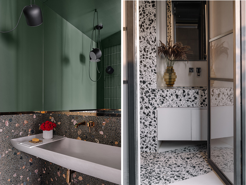
Eye-catching, almost iridescent in its chipped glory, terrazzo cladding for the washrooms is an artisanal masterstroke that brings texture and individuality to surfaces. The choice of a cementitious version for the flooring which feels soft and reliable underfoot is superseded by tiles–its more glamorous cousin for the walls and vanity.
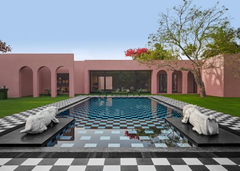
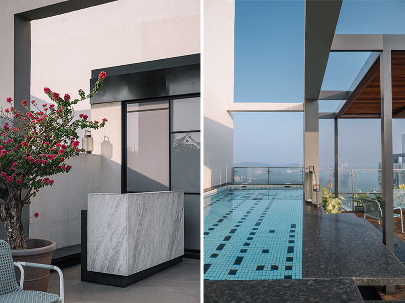
The terrace level is replete with a lap pool, its streamlined layout optimal for swimming lengths, where one would pause only to scan the cityscape in unbridled wonder. Landscaped steps guide you from the pool to a service area where sundowner soirées unfold in an ambience of conviviality and relaxation.
“I think the one important thing to say about the name House of Authenticity came actually from the idea of how the design was approached,” Parekh tells us. “From the beginning, we had a clear vision based on our interactions with the client and how they would inhabit the space.”
Also Read: Three Open-Plan Apartments Where Naked Walls, Homegrown Design, And Earthiness Are The Real Stars
Whether it’s an understated home with a wraparound terrace or a compact loft apartment, the firm’s projects leave an indelible mark on the city’s skyline, contributing to its architectural legacy.

