Bachelor Slick, Goa
- 28 Feb '15
- 11:00 am by Miheeka Bajaj
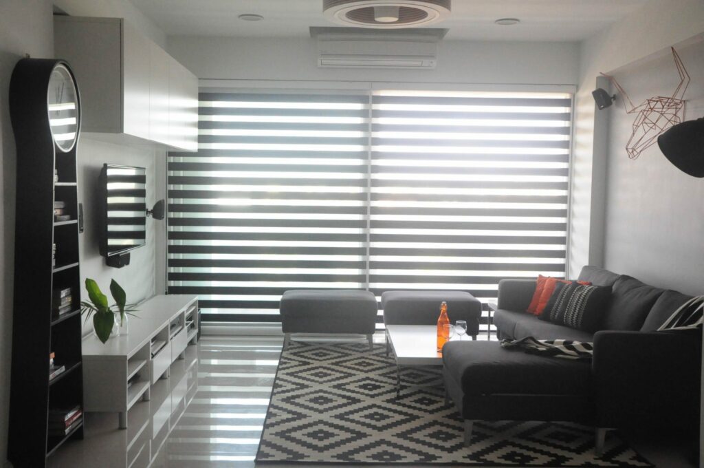
A young Spaniard from Madrid came to Goa with an idea of a perfect bachelor pad in mind. A slick and modern space that would reflect his personality. Designed by Esha Gupta here at Design Pataki, she has modernised the Goa Susegad lifestyle.
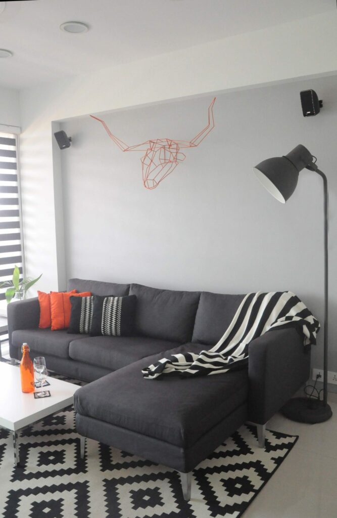
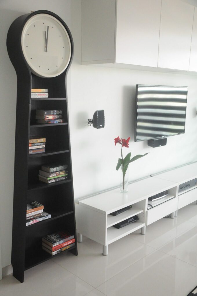
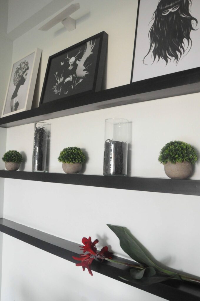
Esha’s main concept was to stick to a monochrome theme through the apartment. Black and white permeates from the furnishings to the furniture. Paying attention to every detail including the graphic prints, which are also black and white.
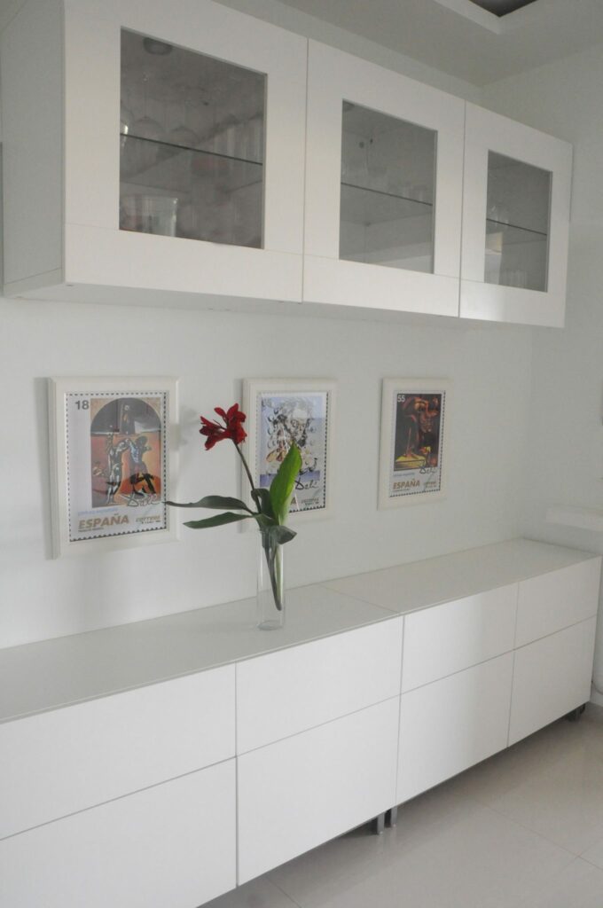
The orange iron bent bull and arrows were sourced from the amazing American Indian designer, Gaurav Nanda. The bull reminds the owners of his home back in Madrid. Since he loved it so much, Esha also included some more Spanish flavor with Salvador Dali prints in thick white frames on the console near the dining area.
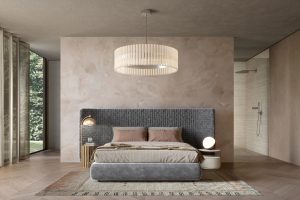
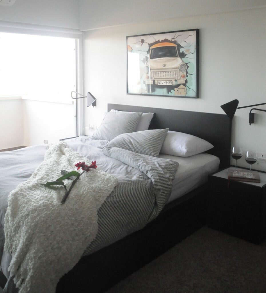
The master bedroom is predominantly black. Black back painted glass make for a slick wardrobes. Taupe rugs and silk finished roller blinds add warmth and richness to the room while still giving it a manly feel. The bathroom has been designed with a mini walk in closet, incorporating shoe racks, a laundry unit and a dresser. To add some pizzaz, super star lights have been put around the bathroom mirror.
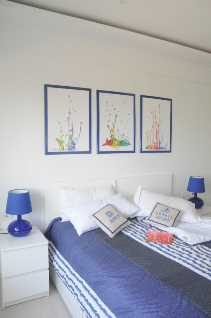
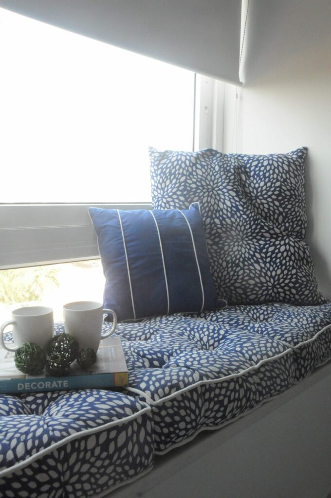
The guest bedroom was designed around the lovely blue lamps on the side table from Ikea. The frames were specially specially repainted blue. The white and blue gives the room a mediterranean feel and brings some of the blue Goa waters home. You can see the fluidity flowing through the prints chosen for the walls. All the soft furnishings in the home were specially designed by us to coordinate the color schemes. The ledge has thick comfortable floor cushions along with lots of throws to make it the ideal morning, coffee lounge space.
The balcony, overlooking the beautiful Arabian Sea, has high black bar stools and a white Corian ledge for snacks & drinks. Making it the perfect place for cocktail happy hours!
The hardest challenge was visualizing the space without seeing the actual pieces as everything was imported from Ikea. And we mean literally everything. From the spoons to the furniture. Can probably ace a test on the Ikea catalogue.
We used the new Asus Zen Phone yet again to play with it on site and compare the shots to our SLR. And we were pleasantly surprised. Its simply amazing how beautifully the camera captured the different hues. The lens picked up all the little details. The contrast and saturation brought out the monochrome scheme brilliantly. Playing with the apertures & exposure helped us achieve different effects making it extremely user friendly.
We hope you enjoyed this home. Keep checking back on Design Pataki for more design finds!
x
Miheeka
Photographs by Design Pataki from #MyAsusZenfone #MyAsusZenFone5

